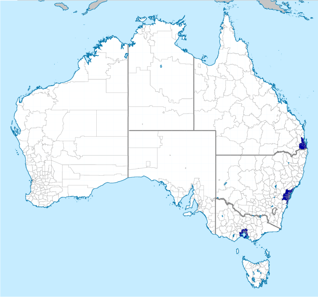
this is so funny because the blue areas aren’t really distinct so it just looks like somebody has posted a picture of all of australia with the caption “half of australia lives here”
just precisely how bad was 1500s jerusalem at making maps, you ask? well,
this…is a fidget spinner
Reblog if you believe in fidget spinner earth.
Ok so a couple of really important things for understanding what’s going on with this map. First, it’s not from 1500s Jerusalem. This is the Bünting Clover Leaf Map from 1581 Hanover, Germany. This turns out to be super important for understanding the map. Why? Because it was made by a Christian.
This is a stylized map. It’s derived from a very popular kind of map called a “T and O map”, which first are found in Iberia around ~600 CE and then became very popular in Europe. Here’s an early one (12th century edition of a 7th century book describing them):
A larger, later, and more detailed one (1300):
And a modern map with the outlines of the T-and-O superimposed:
So what is a T and O map? They were a way to conceptualize the world. Pre-1492, conventional wisdom was that there were three continents: Europe, Asia, and Africa. Asia was the largest and went at the top, with Europe to the bottom left and Africa to the bottom right. The shaft of the T was the Mediterranean, the left side of the crossbar was the Don River, and the right was the Nile River. And at the center? Jerusalem.
Here’s the thing: For most of human history, most people haven’t needed maps to get around. They were either travelling between locations they or someone in their party knew, or they were moving slowly enough (i.e. on foot or by cart) to be able to stop and ask directions. So maps weren’t navigation–they were either for education (Ptolemy’s 2nd cent CE description of the world, which was turned into many, many maps in the Middle Ages) or, far more common, for religious symbolism. Between ~500 and ~1700, the purpose of most maps was to show Christians their place in the world. T and O maps put Jerusalem at the center because it was where Jesus was crucified, and they put Asia at the top because that was where it was believed the Garden of Eden was located.
8th century T and O map from Italy. Adam and Eve are visible in the center top:
The really interesting thing about T and O maps, imo, is that they’re deliberately not accurate. People were certainly capable of making recognizable maps of the world, but they were choosing to go with this more stylized version.
1482 world map based on Ptolemy’s writings:
T and O maps, then, are deliberate. They include only what the map maker thought was important, and that is almost always a religious function.
Our modern maps, meanwhile, evolved out of a combination between the Ptolemaic maps and portolan charts. Portolan charts are navigational maps. They frequently only featured the coastline and ports, but overlaying the map is a set of rhumb lines, or paths with constant bearing with respect to true north.
One of the earliest surviving portolan charts, from 1325 Italy:
Portolan charts, by modern standards, are vastly more accurate than T and O maps, and are visibly a better representation of the Earth than a Ptolemaic map. But from the concerns of a medieval cartographer, they’re very bland and boring. There’s no representation here of important cities, religious locations, or classical allusions. It’s just a map of coastlines.
Back to the Clover Leaf map. In 1492, Columbus changed (among other things) map making. The assumption until 1498 (when it became apparent that this was not Asia and it was not a minor collection of outlying islands) was that the world had three continents–at least three accessible to human explorers. After 1500, mapmakers engaged in a race–sometimes a war–to represent the new discoveries first and most accurately. The result was a series of increasingly recognizable world maps.
There are a ton, and thanks to that and (mostly) accurate records about who went where when, you can start to date post-1492 maps based on what areas of the world they do or do not show. But the most relevant one for this post is this one:
This is a 1582 world map, which depicts a reasonably accurate Europe, Africa (including Madagascar, discovered by Europeans in 1500), and most of Asia. Japan is still difficult, as is southeast Asia; Australia is missing entirely. Over in the Americas, while most of South America is decent, North America has some struggles in the northern and western regions. Baja California is an island and everywhere north of that is missing entirely. In the south, there’s hints that the cartographer was thinking about Terra Australis Incognita–a long theorized ‘counterweight’ to the Northern Hemisphere continents. In the 1500s, various voyages attributed Tierra del Fuego, Indonesia, and Australia to the continent. Its relationship to Antarctica seems to be completely coincidental.
This is a pretty typical late 1500s map.
It’s drawn by the same cartographer as the Clover Leaf map.
Heinrich Bünting wrote a book, called Itinerarium Sacrae Scripturae (Itinerary of Sacred Scripture), in which both maps are featured, along with many, many others. The book uses current knowledge along with the Bible to talk extensively about the Holy Land–which explains why Bünting put such an allegorical map in his book to begin with.
The Bünting Clover Leaf map isn’t an accurate representation of the world–but it does show a 16th century audience how the world was constructed in medieval theology.